aiobservabilitydeveloper-tools
AI agents removed the friction from writing telemetry
I used to avoid adding telemetry because it felt like tedious busywork. Now with Claude handling the OpenTelemetry boilerplate, I'm instrumenting everything.
Happy Wednesday!
I've been working on building a multi-select dropdown this week at work. One of the requirements is that it supports keyboard handling.
Material UI has a similar multi-select dropdown to the one I'm building. The image below represents an example of a dropdown panel with a multiple unfocused dropdown checkbox items, and one focused dropdown checkbox item.
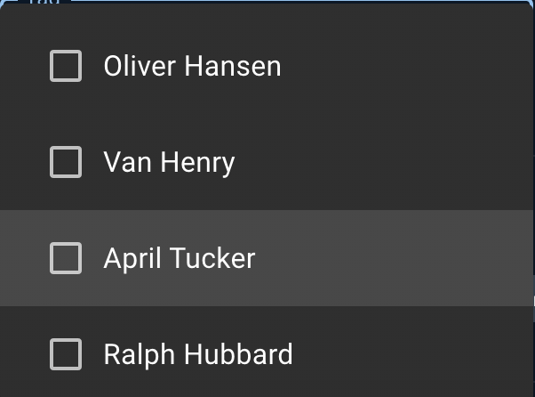
When a user navigates through the dropdown panel with arrow keys, the focused dropdown checkbox item should show the lighter gray style.
Building this is a bit trickier than one might expect though, because while the browser automatically focuses on the actual checkbox, it doesn't apply a focus state on the container that wraps it. Let's dig in!
Here's a basic example of how a DropdownCheckboxItem can be structured:
As a user navigates within the dropdown panel using the arrow keys, the browser will handle focusing each <input type="checkbox" /> in the panel. But we need to apply a focus state to the whole <label />, not the <input />.
The :focus-within pseudo-class allows us to capture that the nested <input /> has been focused by the browser, and then apply whatever focus styles we'd like to the parent, which in this case is the <label /> tag.
Huge shoutout to Jimmy Wilson for showing me the :focus-within pseudoclass!
Talk soon,
Mae
I used to avoid adding telemetry because it felt like tedious busywork. Now with Claude handling the OpenTelemetry boilerplate, I'm instrumenting everything.
AI agents work better when given appropriate context and guardrails.
I've been using Claude Code to offload tedious parts of platform engineering: dependency reviews, generating test PRs, dependency migrations, and project cleanup.