Tooling migrations don't have to take weeks anymore
I used to block out weeks for tooling migrations. Now I let Claude Code run in the background, check in when it's done, and pair with it to understand what changed.
While scrolling through Twitter the other day, I came across this tweet: https://twitter.com/markboulton/status/1397544012224073736

I’ve been asking myself this question for a few years now. The best way that I’ve found to handle customization in a multi-product design system is to build it in layers. When we build in layers, consumers can adjust each layer when customization or differentiation is needed.
If you’re unfamiliar with this idea, I’ve written about in depth here.
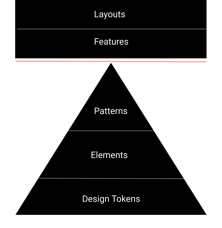
Below, I've added a diagram to share the layers that I try to stick to when building design systems.

In this diagram, design tokens, elements, and patterns are all part of the design system, and features and layouts live in application code. The dotted red line denotes the separation.
Ideally, most of the customization should happen at the design tokens level. Once you have tokens in place, you should be able to apply infinite themes to a wide range of codebases. Since tokens control styling data like color, fonts, spacing, even if the elements and patterns used are identical, the site should look pretty different.
Next, we have our elements (stand-alone components like a radioButton). Our elements should be token-aware so that when our theme changes, the element’s style also automatically changes.
Finally, we introduce patterns, which are composed of 2 or more elements. A good example is a radioList. We can create infinite permutations of patterns by combining elements in multiple ways.
Brands should have the option to use the pattern as-is, or to create new patterns and introduce them to the design system.
I used to block out weeks for tooling migrations. Now I let Claude Code run in the background, check in when it's done, and pair with it to understand what changed.
Frontend technical debt doesn't just slow down developers. It undermines your entire business through user attrition, legal risks, and revenue loss. Here's how to spot and communicate these hidden costs.
How I used Conductor and Claude to streamline my team's Dependabot review workflow — and how a colleague turned it into a GitHub Action